 Network18 reaches 250mn TV viewers, crosses 65bn social video views: Akash Ambani
  MIFF panel agrees youngsters driving documentary renaissance
  At APOS, JioStar’s Chatterjee says India most demanding live sports market
 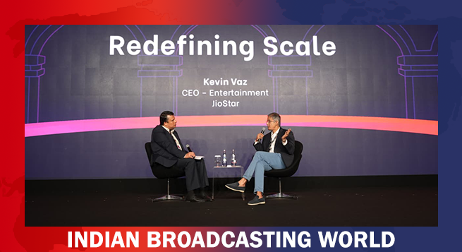 JioStar’s Vaz says focus is on creating integrated consumer experiences across screens
 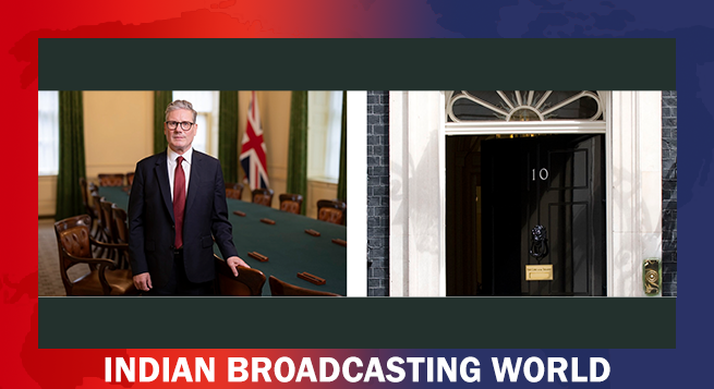 UK proposes sweeping SM ban for under-16s; WhatsApp exempted
  ‘Obsession’ director Curry Barker announces new horror film
 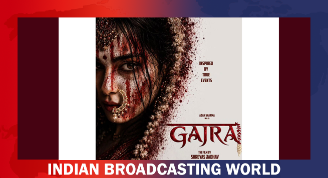 Adah Sharma’s ‘Gajra’ first look reveals her new avatar
  Netflix announces ‘India’s Got Latent’ Season 2 with Samay Raina’s new comedy
 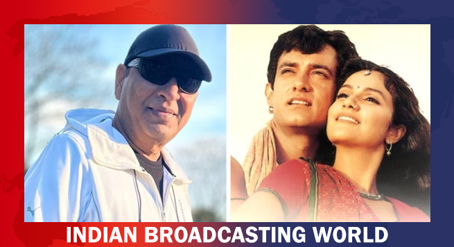 Raju Khan recalls challenges of filming ‘Ghanan Ghanan’


As tech giant Google’s Play Store officially completed 10 years, it is now getting a new logo to celebrate its 10th anniversary.
The tech giant has slightly tweaked the overall shape of its Google Play Store logo, but the most notable changes are the less vibrant colors that more closely match the green, yellow, blue, and red hues that Google uses for many of its other services.
It is a subtle adjustment that also complements the new Chrome logo updated earlier this year, IANS reported from San Francisco.
“We are introducing a new logo that better reflects the magic of Google and matches the branding shared by many of our helpful products — Search, Assistant, Photos, Gmail, and more,” Tian Lim, VP of Google Play, was quoted as saying.
The new logo and iconography also mark 10 years of Google Play after it was rebranded from the Android Market in 2012.