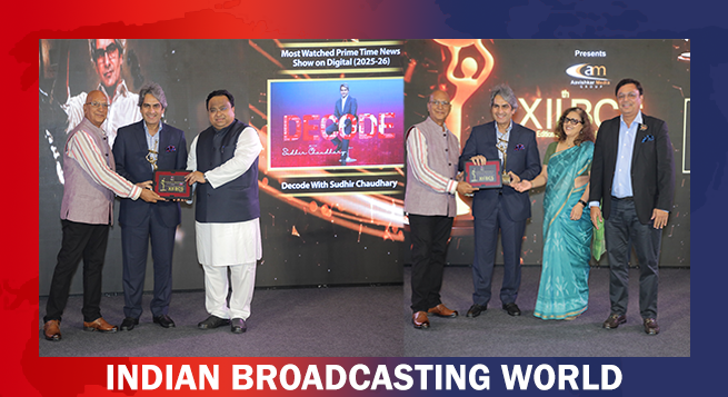
 Sudhir Chaudhary wins two big Honours at XIIᵗʰ BCS Ratna Award 2026
 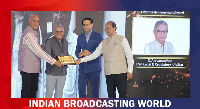 12th BCS Ratna Award: JioStar’s Aravamudhan is Lifetime Achievement honouree
  XIIth BCS Ratna Award : JioStar CEO Entertainment Kevin Vaz honoured
 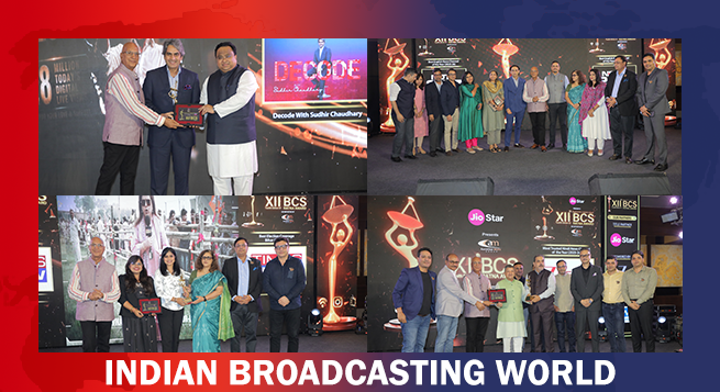 XIIth BCS Ratna Award 2026: Media achievers honoured
 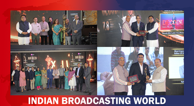 12th BCS Ratna Award a roaring success; honours excellence in M&E
 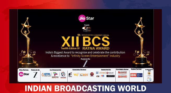 Twelfth BCS Ratna Award boasts stellar lineup; to be held on Aug 5
 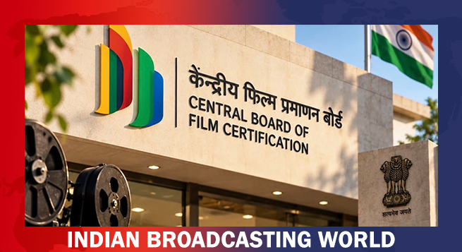 Govt. clarifies CBFC certification changes, says 1991 core framework unchanged
  Govt. invites 13 MSME, startups for initial evaluation for digital ad panel
  Karandeep Anand to be Disney’s first CTO, a newly created post
 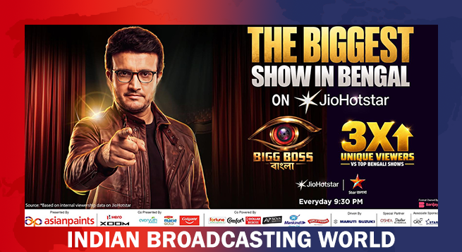 Ganguly-hosted ‘Bigg Boss Bangla’ sets streaming benchmark
  Javier Bardem joins HBO’s ‘The Spread’




As tech giant Google’s Play Store officially completed 10 years, it is now getting a new logo to celebrate its 10th anniversary.
The tech giant has slightly tweaked the overall shape of its Google Play Store logo, but the most notable changes are the less vibrant colors that more closely match the green, yellow, blue, and red hues that Google uses for many of its other services.
It is a subtle adjustment that also complements the new Chrome logo updated earlier this year, IANS reported from San Francisco.
“We are introducing a new logo that better reflects the magic of Google and matches the branding shared by many of our helpful products — Search, Assistant, Photos, Gmail, and more,” Tian Lim, VP of Google Play, was quoted as saying.
The new logo and iconography also mark 10 years of Google Play after it was rebranded from the Android Market in 2012.